Offline Solution
Oxford English Hub
Offline Solution at a glance
Problem: Teachers in regions with unreliable internet couldn't use OEH content in class — 47% of OUP's priority markets face connectivity challenges.
Approach: Interviewed 5 K-12 teachers across Spain, Brazil, and Argentina. Ran 3 task-based usability tests to validate download discoverability, modal clarity, and offline access.
Outcome: Validated the approach, uncovered critical fixes (My Downloads visibility, info bar prominence), and shaped the feature for production launch.
Recognition: Received a Spark Award shout-out for impact on emerging-market accessibility.
From research to recognition
Product design · Journey mapping · UX research · Developer collaboration
I led UX for a technically complex offline-access capability on OEH — shaping download patterns that respect PWA constraints. I worked closely with developers to ensure feasibility, mapped online/offline transition journeys and edge cases, and conducted user testing to validate desirability and usability. The work earned a Spark Award shout-out for its impact.
The offline solution in action
Full product demo — download flow, offline access, and shared-device support
Who we interviewed
Already familiar with the platform
1 teacher had no internet at all
1 shares with other-subject teachers
2 teach primary, secondary & adults
Finding & downloading content
All users identified the trigger immediately
Critical issue — needs relocation or recolouring
Called 'an excellent idea' by multiple teachers
Only 2/5 teachers found this button without prompting
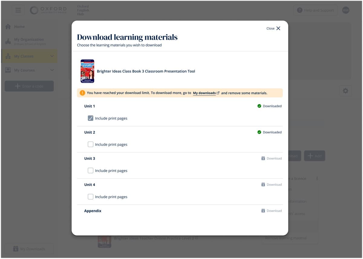
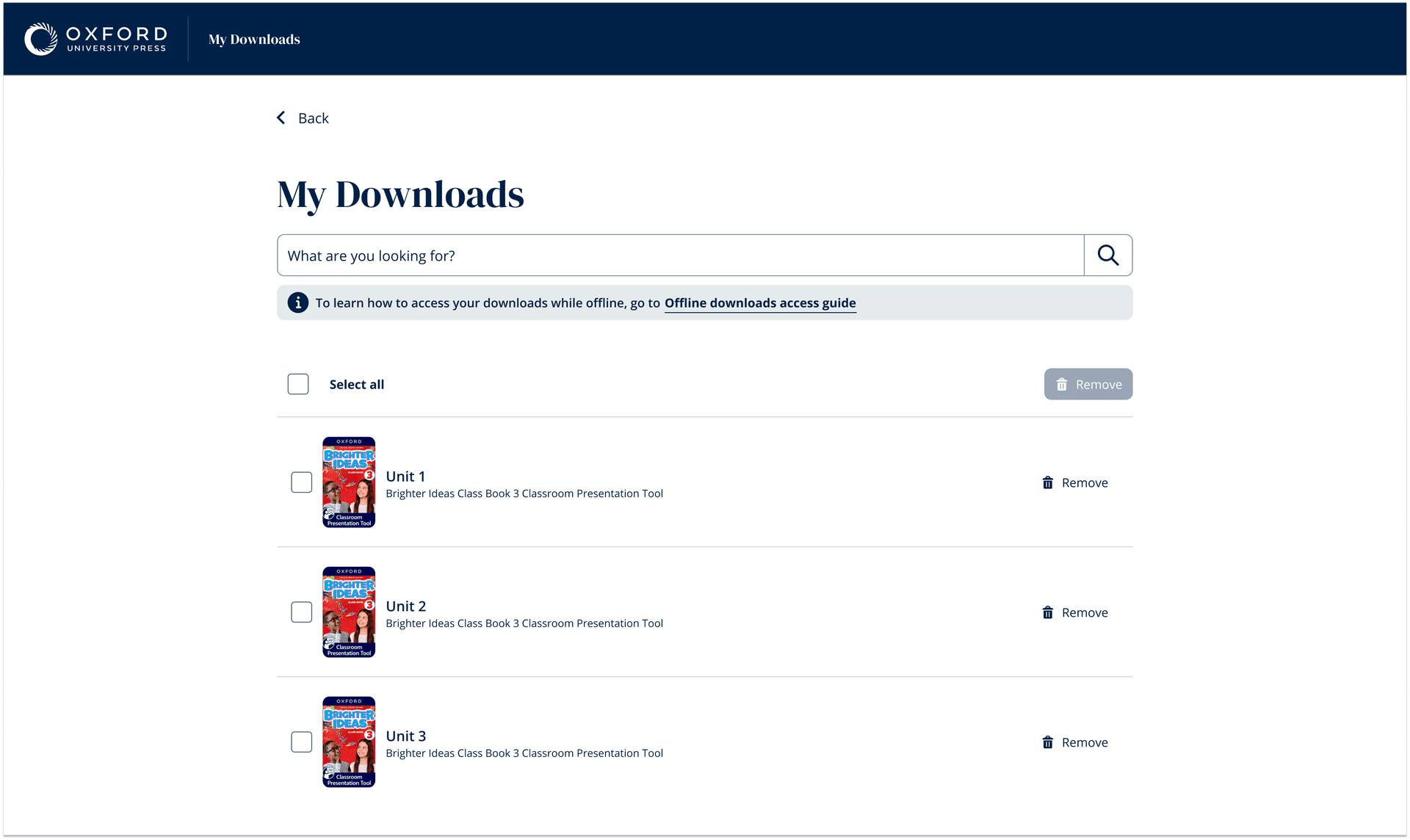
'My Downloads' was invisible
Only 2 of 5 teachers found the button unprompted. The feature worked perfectly — but users couldn't find it. Teachers suggested relocating it or changing its colour. This became the highest-priority fix post-research.
Download modal clarity
Clear and intuitive — navigated with or without it
Overlooked entirely until prompted — needs colour change
Orange bar + disabled button = effective multi-signal design
Greyed-out state signalled 'blocked' before reading text
Offline access & shared devices
One teacher flagged complexity with multiple products
Mental model was clear across all participants
Storage constraints make targeted downloads an advantage
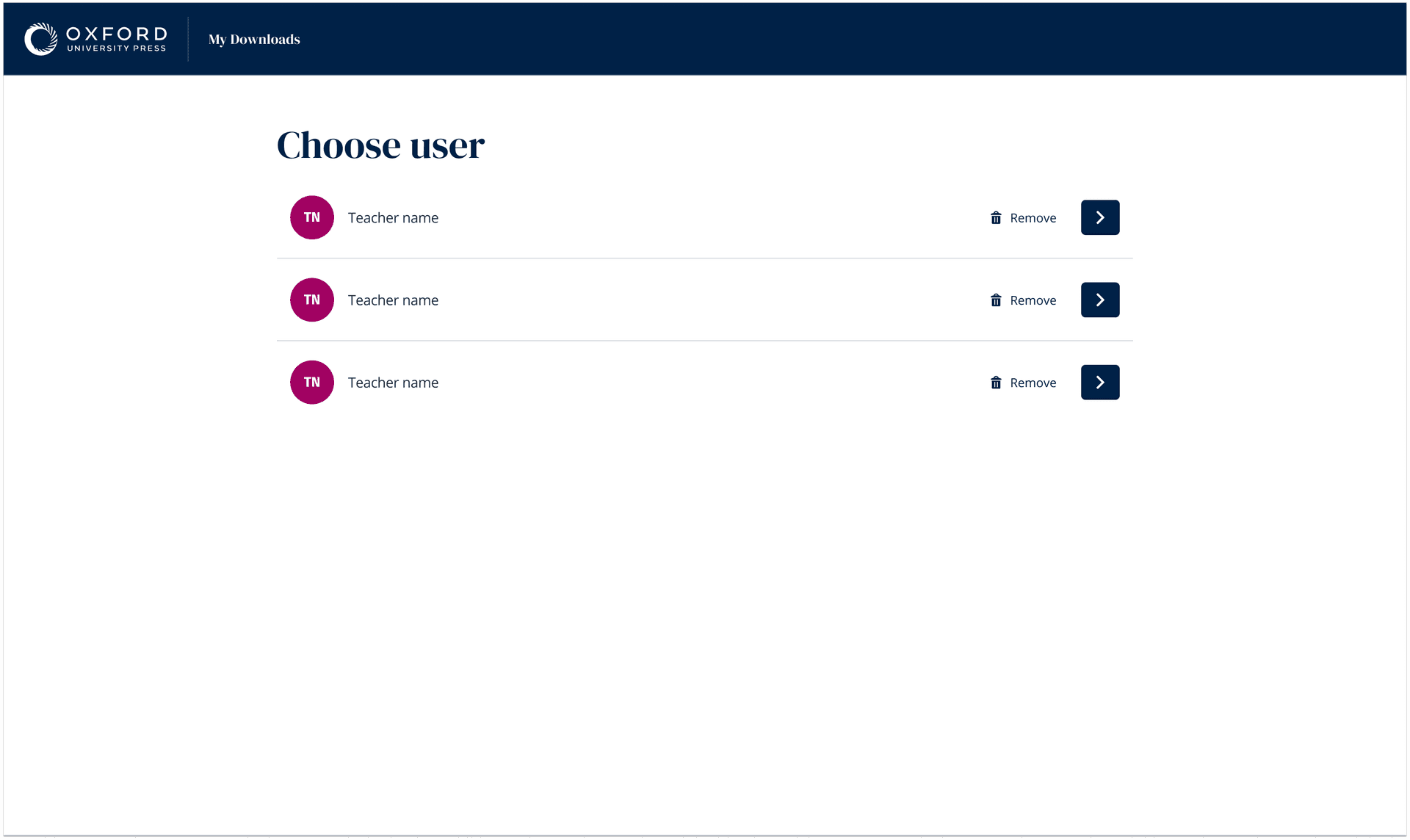
Profile selection — each teacher sees only their downloads
One device, many teachers
Each teacher accesses only their own downloaded content through a simple avatar selection, backed by local encrypted profiles. Validated as clear, but flagged for follow-up research — insufficient data on sharing frequency across markets.
Inline download states, storage estimates, and contextual actions
Download controls woven into the content hierarchy
Each unit shows its offline status, file size, and a contextual action button (Download / Pause / Update / Remove). Bulk downloads trigger from the course header with storage estimates. Everything happens inline — no modals, no lost context.
“This feature transformed how our schools operate. A teacher in rural Colombia downloads the week's lessons every Monday morning at the town's Wi-Fi hotspot, then teaches offline all week. That was never possible before.”
Regional Education Manager, OUP Latin America
What offline taught me about designing for trust
Offline design is fundamentally about trust — users need to know their content is safe, progress will sync, and nothing will be lost. The disabled download button was a gift from usability testing: multi-signal design (colour + state + text) reduces cognitive load in stressful moments. If I were to approach this again, I'd co-design conflict resolution flows with users from the start, and push harder for follow-up research on device sharing before launch.